Beyond the Orbit: The Odyssey Identity
A distinctive visual identity for Odyssey, inspired by exploration, movement, and technological progress. The identity combines a custom orbital symbol, futuristic geometric typography, and a monochromatic palette to establish a modern and recognizable brand presence.

An Identity Defined by Exploration
Odyssey is a technology company focused on building digital products, software solutions, and technology experiences. We developed a visual identity that reflects the brand's ambition and forward-thinking vision through a dynamic orbital symbol, modern geometric typography, and a minimal black-and-white aesthetic.
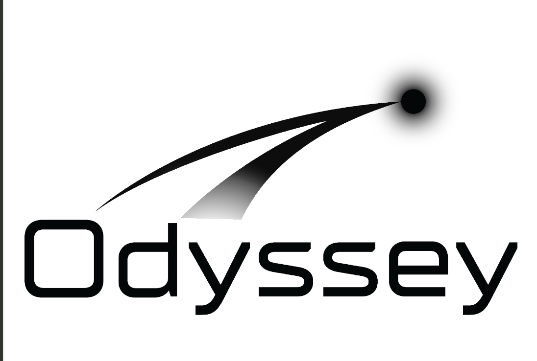
Giving Movement a Distinctive Form
The challenge was to connect the meaning of Odyssey with its identity as a technology brand. We wanted to communicate exploration, direction, and progress without relying on conventional technology symbols. The result needed to remain visually simple, recognizable, and adaptable across different brand applications.

The Orbital Mark
We designed a custom orbital-inspired symbol using two sweeping curved forms that lead toward a luminous endpoint, creating a sense of movement, direction, and discovery. The geometric wordmark complements the symbol with a futuristic character, while the monochromatic palette ensures clarity and versatility. Full logo compositions and standalone symbol variations provide flexibility across digital platforms and brand environments.

A Visual Identity with a Clear Direction
The final identity brings exploration and technological ambition together through a distinctive orbital symbol and carefully considered typography. Its monochromatic variations and flexible logo compositions establish a consistent visual language across the Odyssey brand.