From Concept to Craft: The Odyssey Website
An internal creative redesign of Odyssey's digital presence, transforming an ordinary, generic-looking website into a distinctive agency experience through a considered visual identity, expressive typography, and carefully structured layouts.
Giving Odyssey a Digital Identity of Its Own
Odyssey is a technology and digital solutions company working across software, e-commerce, mobile applications, and digital products. We redesigned our own digital presence to create a stronger brand expression, communicate our capabilities, and present our work through a more intentional visual experience.
Moving Beyond the Generic Agency Look
The earlier website lacked a distinctive visual personality and relied on familiar layouts and generic design patterns. It did not fully communicate Odyssey's creative ambition or the quality of work we wanted to represent. The challenge was to move beyond an ordinary, template-like presentation and build a cohesive experience that felt intentional, recognizable, and genuinely representative of the brand.
A More Intentional Digital Experience
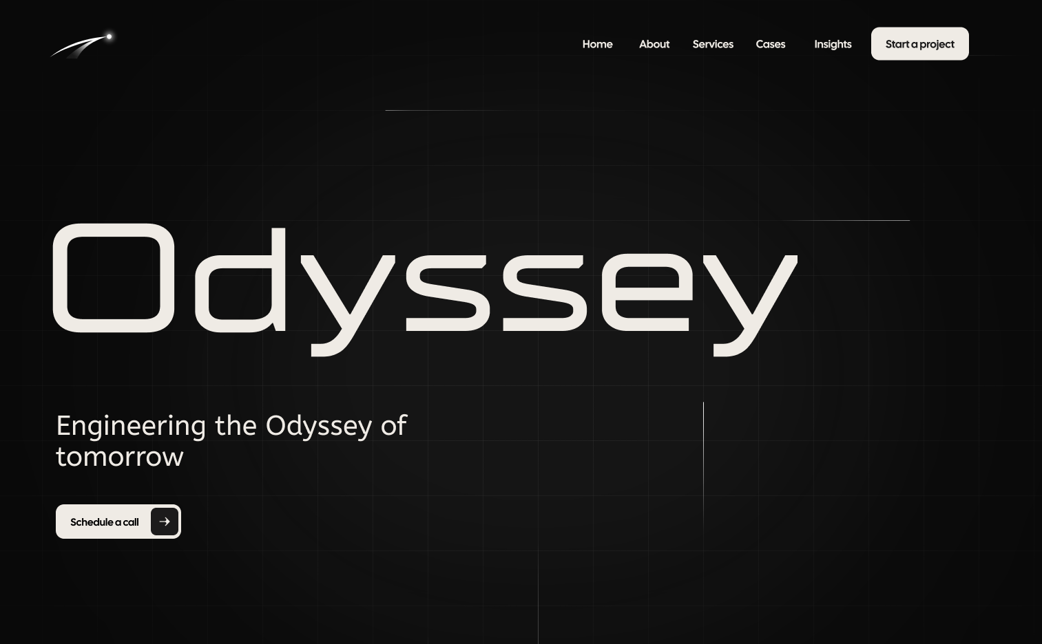
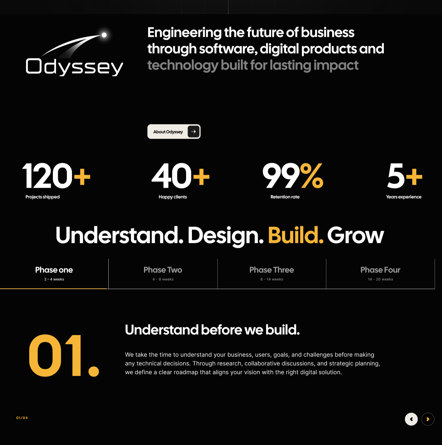
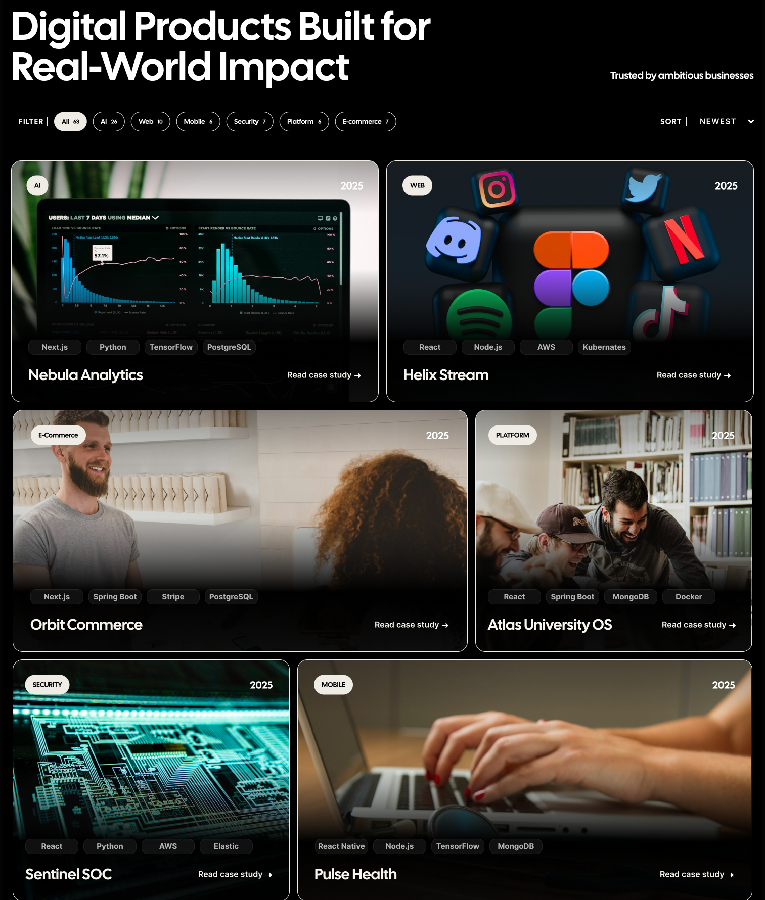
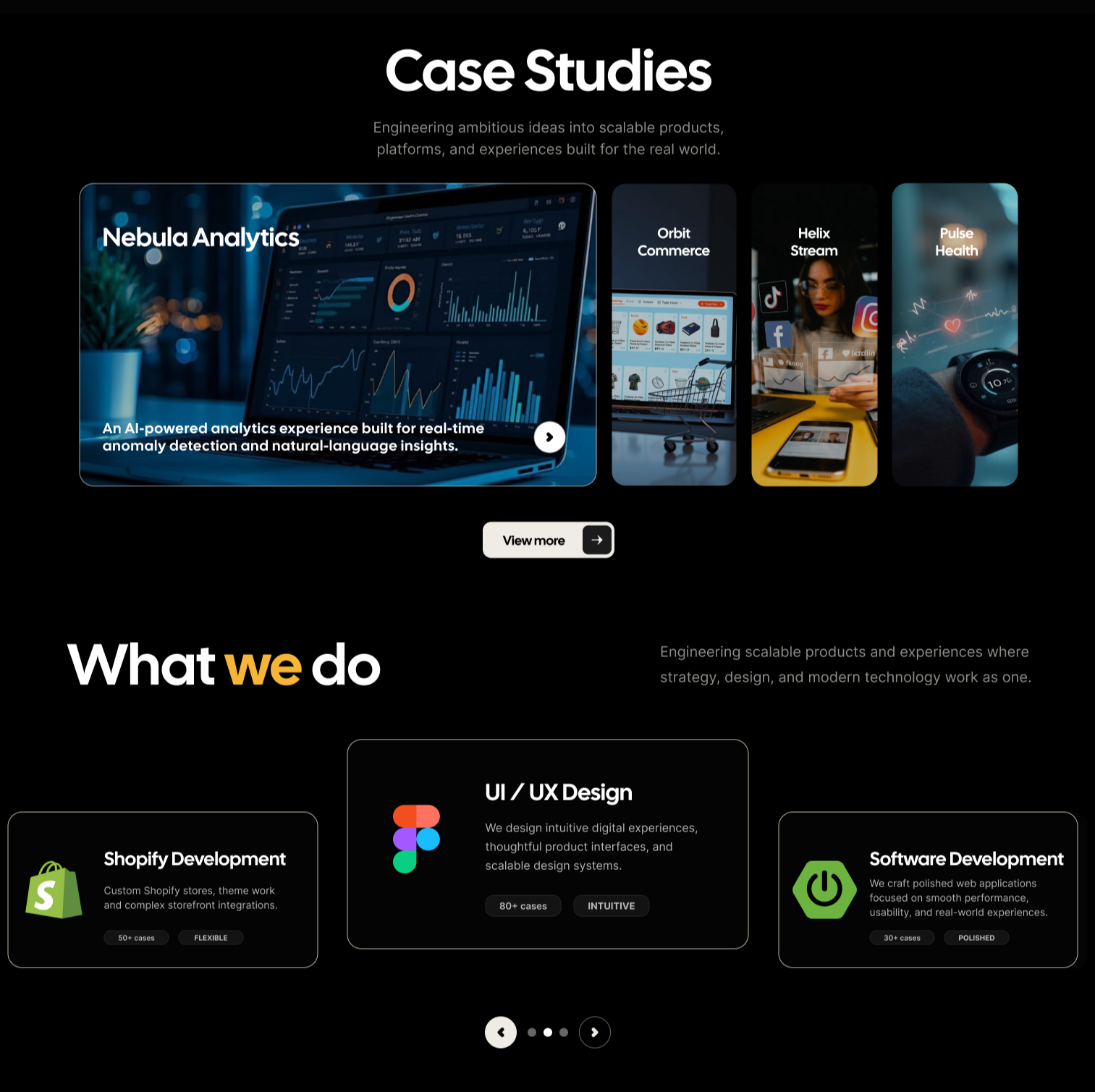
We established a minimal monochromatic visual language built around bold typography, generous spacing, subtle grid patterns, and refined interface details. An oversized wordmark gives the landing page a strong identity, while image-focused portfolio cards and category filters make project discovery more engaging. Structured pricing sections communicate service offerings clearly, and a guided contact experience creates a more purposeful path from exploration to inquiry.
One Cohesive Experience Across the Brand
The redesign gives Odyssey a more recognizable digital presence, replacing generic presentation patterns with a consistent visual system. From the landing page to the portfolio and contact experience, every section contributes to a more deliberate expression of the brand.